The Door
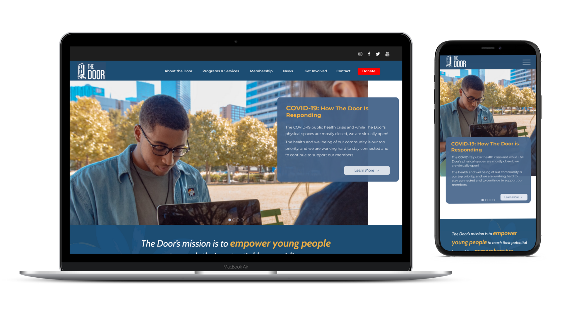
Our team worked on re-designing an existing website for a non-profit organization, The Door. We started from the beginning phases of research, through to our hi-fidelity prototype with secondary breakpoint designs, as well as next steps that we would like to explore moving forward.
This case study explores the process our team took in providing the client with user based design solutions and highlights the choices we made as UX designers centering user research.
Project Duration
2 weeks
My Roles
Scrum Master
UX Researcher
UX Designer
Team
Christopher Matthews
Peter Herron
Abe Galva
Deliverables
Persona
Journey Map
Lo-Fidelity Wireframes
Mid-Fidelity Wireframes
Hi-Fidelity Wireframes
Secondary Breakpoint Designs
Prototype
Wireflow
Zeplin Handoff
About the Project
This project was developed with two colleagues and myself to redesign an existing website for a nonprofit organization “The Door”.
This case study highlights our work and how we used the UX design process to successfully research, evaluate, design and test the website.
Our goal was to improve the users online experience of supporting a nonprofit by ensuring easy access to essential content that will inform, inspire and convince users to feel confident that they are contributing to a credible organization.
Discovery
User Interviews
Screener Survey and Results
We created a short screener survey using Google forms to target the most appropriate people we wanted to use for our user interviews in order to get quality information and insights about how users support nonprofits.
The survey consisted of 11 questions and focused on securing people that were actively involved with nonprofits in an ongoing capacity.
We conducted a total of six user interviews with participants who completed our screener survey. The interviews aimed to discover the behaviors, goals, needs and pain points from the process of connecting and contributing to nonprofits using their website and accessing information. We were able to divide and conquer to interview participants and came together with our results to synthesize our data.
What We Found
From our interviews we found valuable information on what users want and need in order to support and volunteer at a non-profit.
Mission
A clear mission statement, knowing what the organization stands for.
Impact
Evidence of the nonprofit’s positive impact within its community.
Story
Compelling personal stories from nonprofits to empathize.
Navigation
Clearly structured, and easy to navigate site with useful resources.
Define
In order to put all of these insights and findings into a comprehensive and understandable format, we created a Persona that represents our users. This was important for our team to refer to throughout the process and equally provides a clear understanding of who the user is and what their needs, goals, pain points, and behaviors are, in a visual representation.
Persona
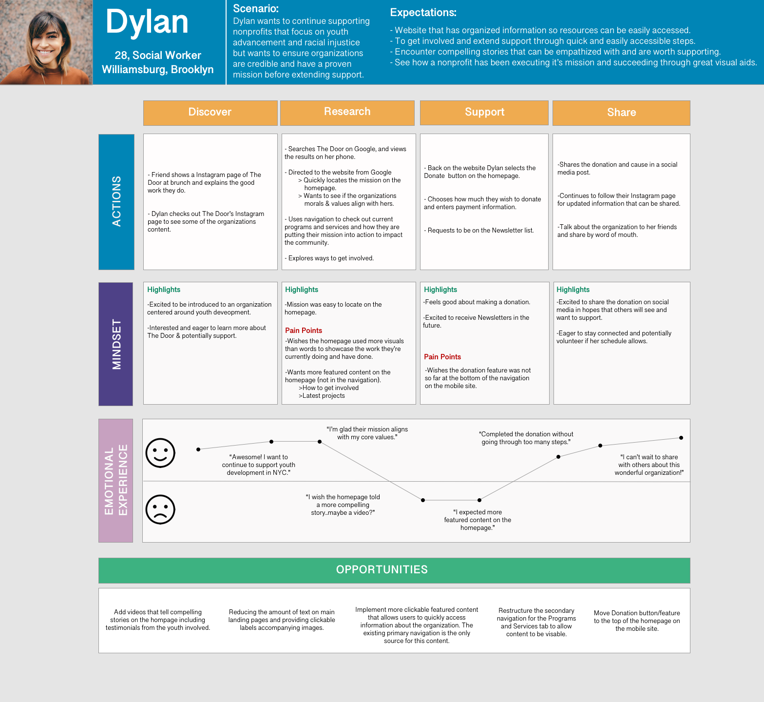
From our research we generated a persona by the name of Dylan to reflect our target user to utilize and refer to while redesigning our client, The Door’s website. The persona helps to put the relevant information and data we collected about our users to the forefront. Our persona is a young woman that has some spare time to volunteer and support nonprofit organizations. She also has an outgoing personality perfect for working with teenagers and young adults. She found out about The Door from a friend and visited the website to see how she can extend her support.
Journey Map
After creating our persona, we wanted to see what the experience of accessing The Door’s website was like for Dylan. To accomplish this, we created a journey map.
Through this process we were able to see her actions, mindset, and emotional experience throughout the phases of her encounter with our client.
learns about the organization
interacts with the website
discovers information
initiates contribution
shares the information with others
We learned that there are some highlights and pain points throughout her journey from excitement and eagerness to learn more once she discovers the organization, wanting to see more visual content and stories about the impact and their latest projects, to feeling good about making a donation and feeling excited to potentially get more involved and share with others about the organization.
Opportunities
Adding more visuals and videos to tell compelling stories on the homepage including testimonials.
Implementing more clickable content for Dylan to easily access information about The Door.
Problem Statement
Dylan wants to support credible youth development organizations that share compelling stories and provide visible evidence of its mission’s impact.
How might we enhance her ability to connect with the nonprofit’s mission and access key information that will help convince her to contribute?
Usability Testing [Existing Site]
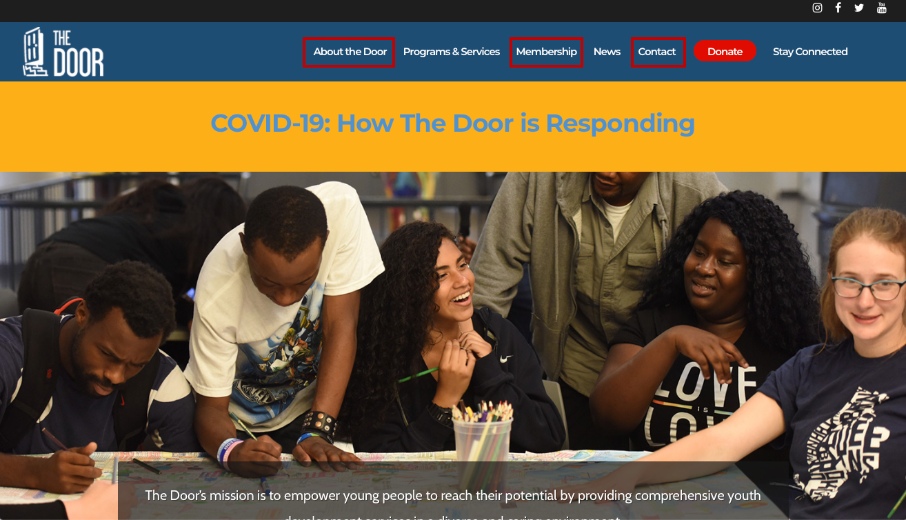
Requiring more information before redesigning, we tested the existing website with users to discover the opportunities in how to improve the content and structure of the site as well as examine users ability to complete key tasks. We found that the users were not sure where to look when considering how to get involved. In the image below of the existing website, we highlighted all areas that the participants initially selected.
Due to the lack of clear indicators to guide the users to where to get involved, users selected different primary navigation categories (“About The Door”, “Membership” and “Contact”) when searching for ways to connect with the nonprofit to volunteer.
The results showed that the process of expressing interest and getting involved with the organization is not intuitive and accessible.
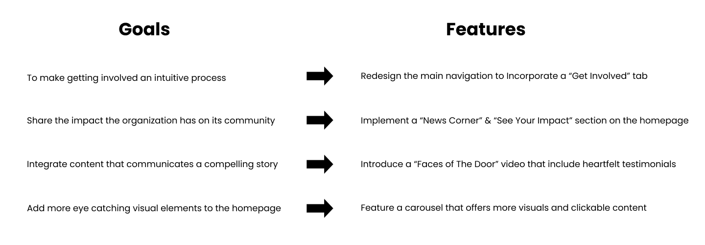
As a result, it became apparent that creating a new navigation item clearly labeled “Get Involved” was the biggest area of opportunity.
Design
Knowing what was important for Dylan from our research, we wanted to focus our design on incorporating features, make design decisions to capture her needs and create solutions to address her pain points. We conducted a Design Studio to draft potential designs.
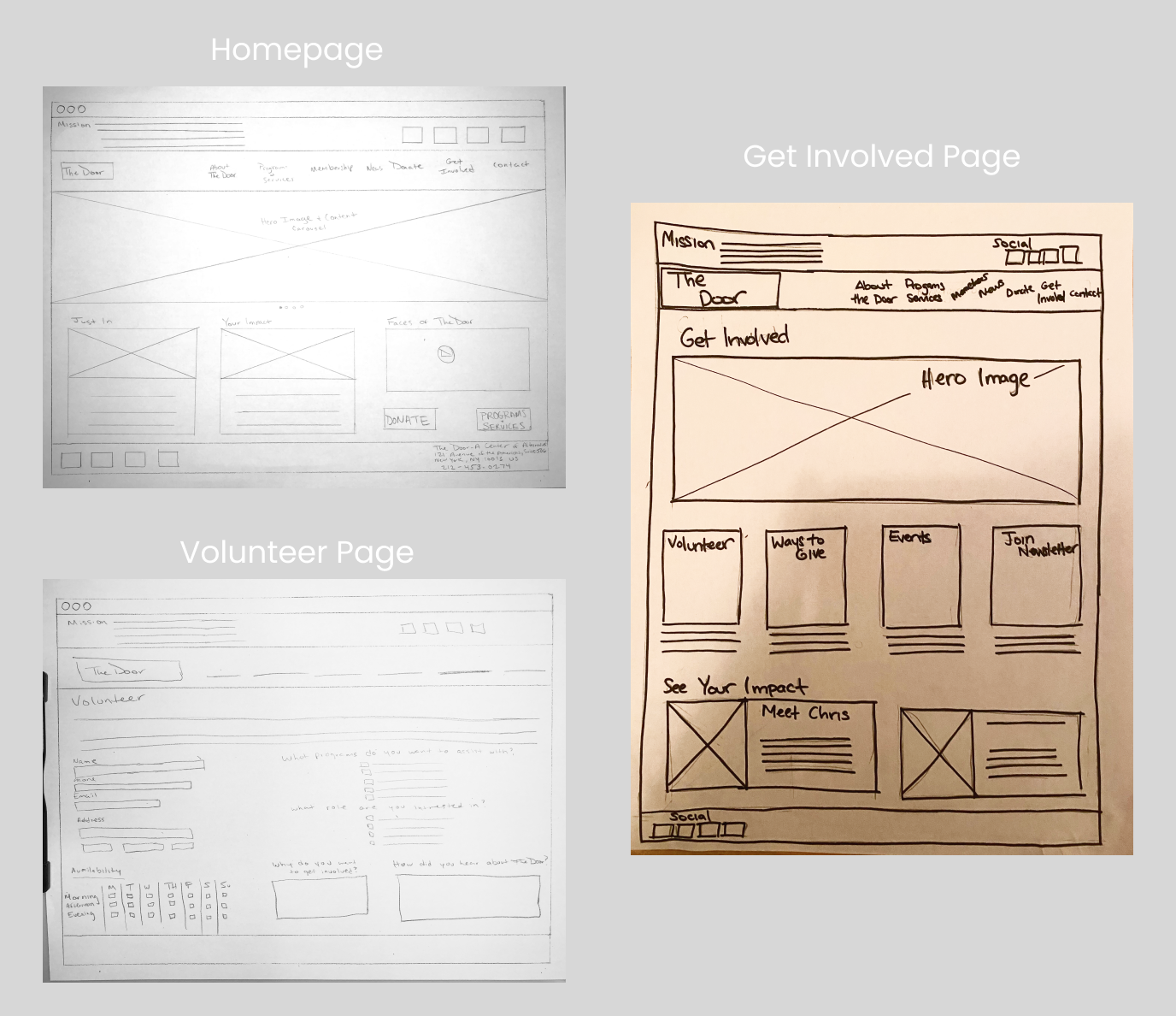
Lo-Fidelity Sketches
Homepage
“Get Involved” in the navigation
Mission Statement above the navigation.
Just In/ News
Your Impact
Faces of The Door Video
Additional Donate CTA
Get Involved Page
Hero Image for visuals
Volunteer page link
Other ways to get involved
Events
Ability to receive the newsletter
See your Impact section
Volunteer Page
Volunteer form directly on the page
Availability questionnaire
Questions related to what type of volunteering the user is interested in
Open field text box for generating qualitative data on why they want to get involved
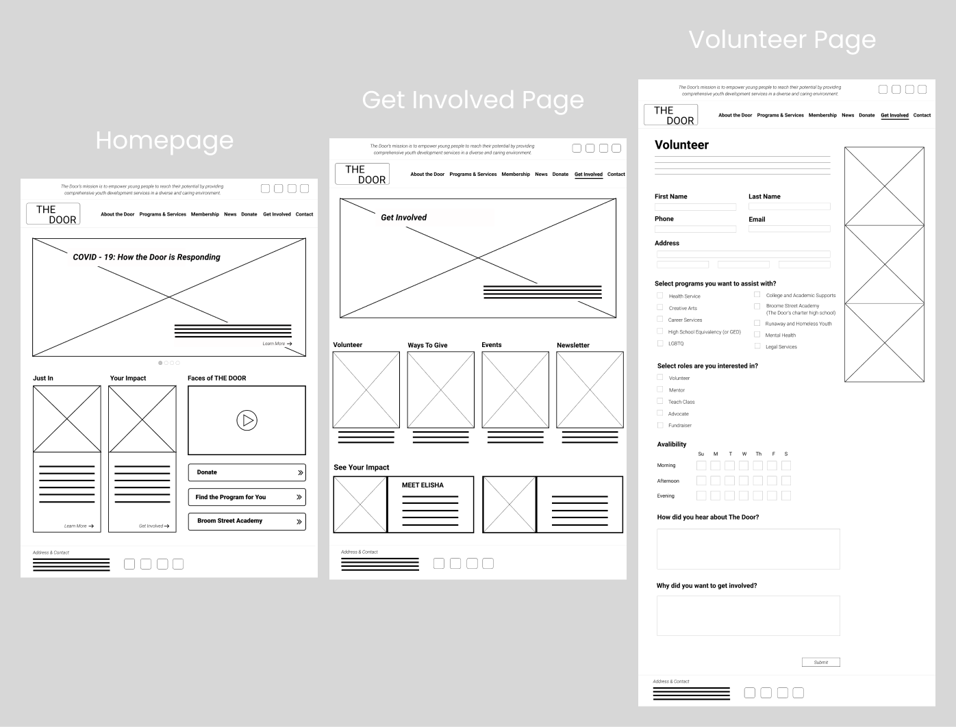
Following our design studio, the team used a software program called Figma to create mid-fidelity wireframes that mirrored our sketches.
Mid-Fidelity Wireframes
Homepage
Included a carousel of content instead of having a singular static hero image. This allowed quick access to key information for the user, accompanied by visuals, that represent how the organization is putting their mission into action.
The team wanted to capitalize on the space available. The overall goal was to create a design that had more of a visual impact.
We also wanted to include content that would immediately showcase the organization’s impact on its community.
Get Involved Page
In the primary navigation a “Get Involved” category was added, aimed to address the biggest problem area the team uncovered from the first round of usability testing on the existing website.
The “Volunteer” page can be accessed from the “Get Involved page” with all the other ways to contribute to the organization. If the user hovers over “Get Involved” they can view the secondary navigation options, and specifically choose the “Volunteer” button to be instantly directed to the “Volunteer” page.
Volunteer Page
Once all areas of the volunteer form are completed, and they select submit, they will receive a pop-up confirming the submission and informing the user that the action was recognized. The information includes a Thank you message expressing gratitude for the action the user took.
Testing
After creating the mid-fidelity prototype we conducted another round of Usability testing.
What we found:
Most users accessed Volunteer page from the secondary navigation.
1 user accessed Volunteer page from the feature content in Carousel.
Get Involved page was not accessed but offers another path for the user.
All users that described the process of locating the “Volunteer” page as seamless, intuitive and clear.
Volunteer form could be shortened, they would prefer answering basic questions and later receive a follow-up from a staff member of the organization.
Delivery
Taking those results and feedback into consideration, we moved into building our hi-fidelity mockups.
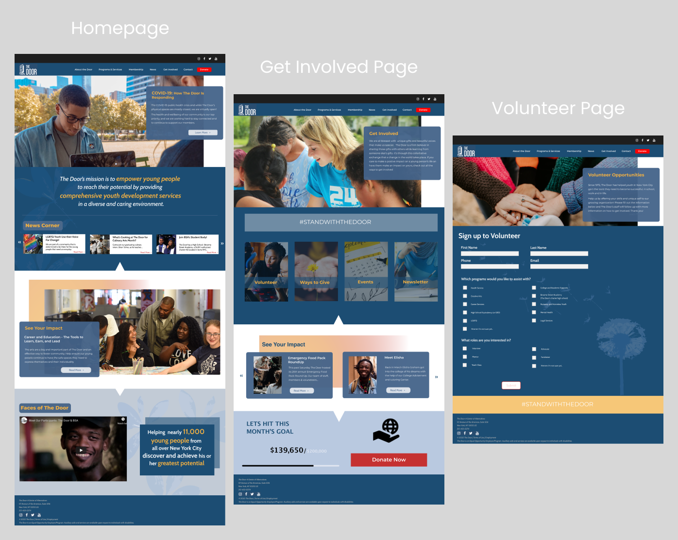
Hi-Fidelity Wireframes
Homepage
Mission Statement enlarged and moved to a more visible location.
Carousel of informative clickable content and visuals that showcase the organization’s work.
News Corner & See Your Impact for latest information and updates.
Faces of The Door video providing compelling stories for empathy.
CTA directly to the Volunteer page.
Get Involved Page
“Get Involved” in the primary navigation.
Cards that are grayed out, signaling its inactive state, but when the user hovers over the cards, the selection changes state.
Access to the Volunteer page.
See Your Impact section to provide more compelling stories and the impact of the organization.
Volunteer Page
The Volunteer Form was shortened based on feedback from the Mid Fidelity Wireframe testing. Three questions were removed from the previous mock-up.
The Submit button has two states, it remains in the inactive state until all the required questions on the form are completed, a way of reducing user error and requiring the user to answer all questions.
Users are met with a pop up indicating that their volunteer form was submitted successfully. It positively adds to the user experience.
Testing
Usability tests were conducted to gain some feedback and valuable insights on the updated website design.
What we found:
It would be clearer to the user to rename the “Membership” label in the primary navigation in order to specifically indicate that the page is directed to youth wanting utilize services from The Door.
The speed of the carousel of photos and hero section on the homepage was a little too fast for users to have enough time to read the information displayed.
Some users stated that it made more sense to choose the volunteer role they were interested in prior to selecting what program they want to volunteer.
“The process was pretty easy. If I knew I wanted to get involved, I would know exactly where to go on the website.”
Next Steps
Move the “Get involved” item before the “News” item in the primary navigation, so that it’s in a more prominent location.
Switch the order of the questions asked on the “Volunteer” page, moving “Which role are you interested in?” first, followed by the question “Which programs are you interested in?”.
Have an option to add an “Other” option and allow the user to input their role of choice if the role they want to offer is not listed.
Hi-Fidelity Prototype
